How to create a Histogram chart in Excel: A Step-by-Step Guide with Examples
When working with large datasets, visual representation is essential for analyzing distribution. One of the most effective tools for this purpose is a histogram chart in Excel. Unlike a bar chart that compares discrete items, a histogram groups numbers into ranges (called “bins”) to show frequency distributions. Whether you’re analyzing test scores, sales figures, or customer satisfaction surveys, histograms offer powerful insight into how your data is spread out.
In this comprehensive guide, you’ll learn how to create a histogram chart in Excel, explore three hands-on examples with sample data, and find answers to frequently asked questions about histogram usage in Excel.
Table of Contents
What Is a Histogram Chart in Excel?
A histogram chart in Excel is a graphical display of data using bars of different heights. Each bar groups numbers into ranges, showing how many data points fall into each range. This type of chart is particularly useful when analyzing the distribution and spread of continuous data.
Key elements include:
- Bins: These define the range of values each bar covers.
- Frequency: The number of occurrences within each bin.
- X-axis: Represents data ranges.
- Y-axis: Shows the frequency count.
How to Create a Histogram Chart in Excel
Before jumping into examples, let’s go over the basic steps for creating a histogram chart in Excel (2016 and newer versions):
Step-by-Step Instructions:
- Enter Your Data: Organize your values in a single column.
- Select the Data: Highlight the cells containing the data.
- Insert the Histogram:
- Go to the Insert tab.
- Click on Insert Statistic Chart in the Charts group.
- Choose Histogram.
- Customize the Chart:
- Click on the chart to format axes.
- Adjust bin width or number of bins under Format Axis.
- Add Chart Elements (Optional):
Use Chart Elements (the “+” icon) to add axis titles, chart title, or data labels
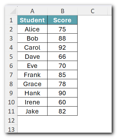
Example 1: Analyzing Exam Scores
Sample Data:
Steps to Create Histogram:
- Select the data and go to Insert → Insert Statistic Chart → Histogram.

2. Click the chart, then right-click the horizontal axis → select Format Axis.

3. Under Axis Options, set the Bin width to 10 for cleaner groupings (60-70, 70-80, etc.).

Result: You’ll see how many students scored within each 10-point range, revealing the overall grade distribution.
Example 2: Categorizing Sales by Product Type
Scenario:
You’re managing monthly sales across various product categories, and you’d like to visualize how frequently certain revenue ranges appear — but your data isn’t initially in a single column. Instead, it’s spread across categories. Before creating a histogram chart in Excel, you need to consolidate the data using a formula.
Sample Data:

Steps to Create Histogram:
- Combine Sales Figures Using a Formula – In a new column, use the following formula to sum sales for each month:
=SUM(B2:D2)
Drag it down for each row to get total sales per month.

2. Select the Total Sales column, go to Insert → Statistic Chart → Histogram.

3. Set a bin width of 300 for tighter sales range comparison.

Interpretation:
You’ve taken a multi-column dataset, used Excel’s formula features to reshape the data, and then visualized the consolidated results using a histogram. This method is especially helpful for retail or e-commerce analytics.
Example 3: Age Group Distribution from Date of Birth
Scenario:
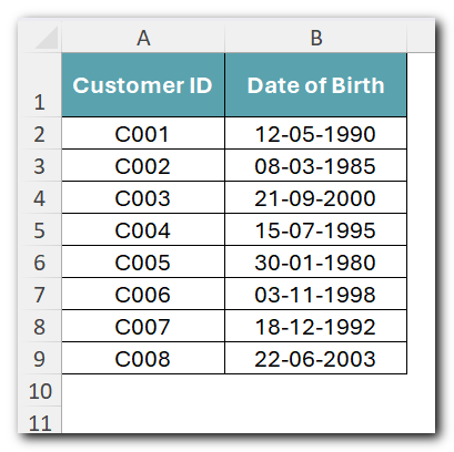
Your dataset contains customer birth dates, but to create a histogram chart in Excel, you need to visualize age group frequencies. First, you’ll calculate each customer’s age using a formula, then build the histogram from that derived data.
Sample Data:
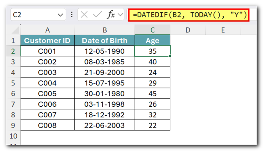
1: Calculate Age – In a new column, use this formula to determine each customer’s age:
=DATEDIF(B2, TODAY(), "Y")
Drag it down for each row to get age of each customer.
2: Select the Age column, go to Insert → Statistic Chart → Histogram

3: Set bin width to 5 to create age groups.

Insight:
This method is common in demographic analysis for marketing. Instead of plotting raw birth dates, which aren’t histogram-friendly, you’re converting them into age values using a formula, making the histogram meaningful and readable.
Tips for Creating Better Histograms in Excel
- Use Clean, Numeric Data: Excel histograms work best when there’s no text or blank cells in your dataset.
- Adjust Bin Sizes Wisely: Too few bins oversimplify data; too many make it messy. Aim for balance.
- Label Axes Clearly: Always define what each axis represents.
Frequently Asked Questions (FAQs)
Yes, but it requires manual bin setup and a frequency formula using FREQUENCY() or COUNTIFS(), then using a bar chart.
In Excel 2016 and newer, it’s under:
Insert → Charts Group → Insert Statistic Chart → Histogram.
In earlier versions, use Data Analysis Toolpak:
- Go to File → Options → Add-ins → Manage: Excel Add-ins → Go.
- Check Analysis ToolPak, then click Data → Data Analysis → Histogram.
Yes, using PivotTables combined with slicers or dynamic named ranges can give you interactive histograms.
Click the horizontal axis on your histogram chart, then:
- Choose Format Axis.
- Set Bin width manually or change the number of bins.
Excel’s built-in histogram doesn’t directly support grouped frequency tables. You’ll need to use a bar chart with custom bins and values.
Final Thoughts
Mastering the histogram chart in Excel allows you to extract meaningful insights from raw data. Whether you’re examining trends in sales, student scores, or customer satisfaction, histograms offer an intuitive and impactful way to analyze the shape and spread of your data. By following the steps and examples above, you’ll be well-equipped to transform columns of numbers into compelling visual stories.
Remember, the strength of your histogram lies in how well you define your bins and understand your dataset. Keep refining and exploring Excel’s formatting tools to make your visualizations even more insightful.