Pareto principle was introduced by Italian Economist Vilfredo Pareto. He stated that 80% of the effects are caused by 20% of the causes. So if we closely monitor and solve 20% of the causes. It will significantly improves the affected area and you will see good results.
For Example: 80% of the revenue gets generated by 20% of the clients
While doing research Mr. Pareto found that 20% of land in Italy was occupied by 80% of the population. He carried out this survey to other areas and got same results
This rule is also well known as 80/20 rule across the globe and is mostly being used to find the causes which is impacting business or producing defective products/services
Hence Pareto chart is a graphical representation of Pareto Principle
Pareto Chart studies the frequency distribution and advise you the most impacted/affected areas. So you should use Pareto Chart when:
Here are few steps to collect data before you start preparing your Pareto Chart in Excel:
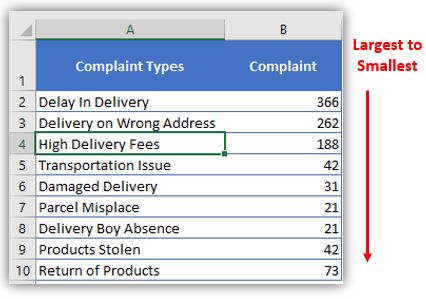
Here I collated the Complaints data from one of the Courier Company survey and will create Pareto Chart for them. Lets follow the steps now:
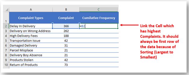
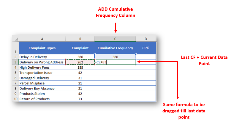
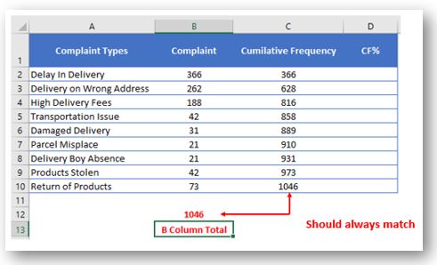
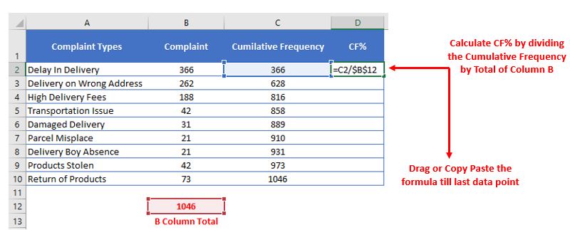
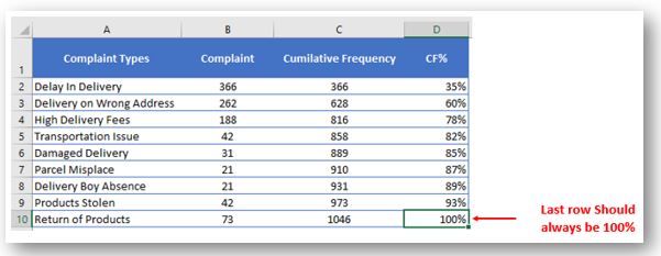
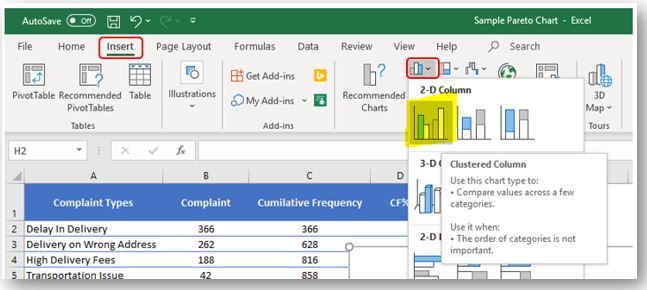
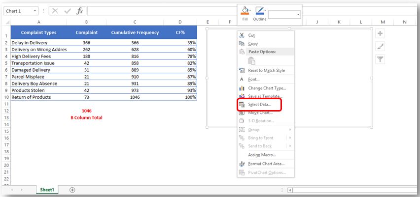
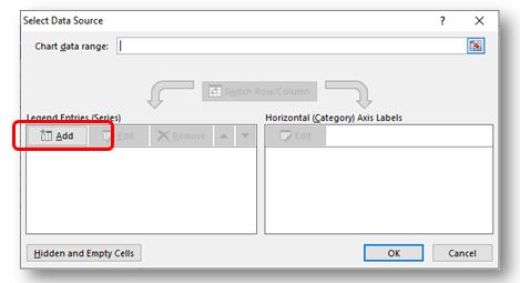
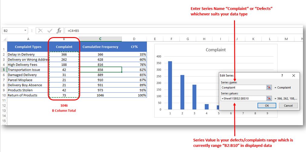
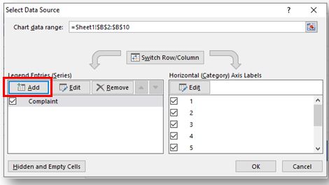
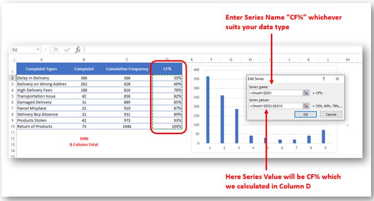
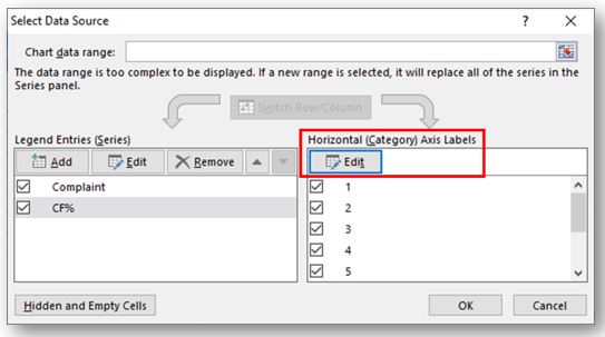
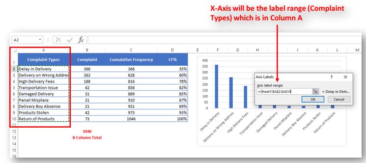
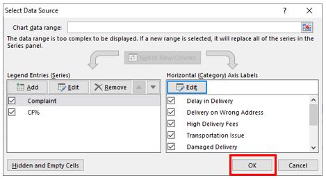
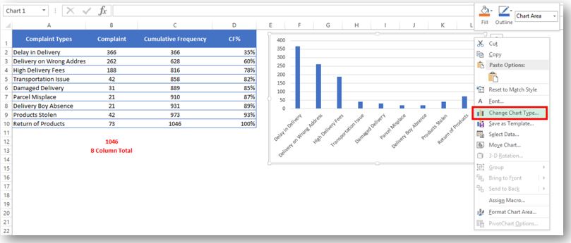
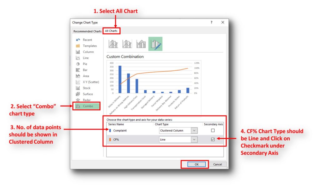
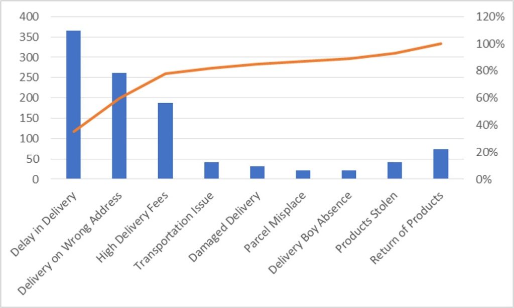
So here your Pareto chart is ready. This will help you to showcase the major pain areas or impacted areas in visual display
Now if you want to make this chart more appealing and visual. Then you can do this by learning tricks about formatting charts.
Hope you liked this article. Please comment below for any questions and for your feedback about this tutorial.
Follow us by Subscribe Us option for new updates

If you need to keep This quick guide explains what Excel circular references are and why you should be careful when using them. You’ll also learn how to check for, find, and remove circular references in Excel worksheet.a circular reference, it will show you how to turn on and use circular formulas safely
You tried to enter a formula in your Excel sheet, but it’s not working. Instead, Excel is showing you a message about a circular reference. Is that why you’re here? 🙂
Thousands of people run into this issue every day because they accidentally make an Excel formula try to calculate its own cell. When this happens, Excel gives the following error message:

Today, I’ll show you how to add bullet points in Excel with simple steps and clear images, so you can easily highlight key points in your Excel reports for better clarity and readability. Bullet points…

Scroll Lock in Excel can make scrolling, selecting cells, checking formulas, entering data, and recording macros harder. So, you might need to turn it off to work normally. In this article, we’ll show you how…

An easy way to transform an array or range into a column with the TOCOL function. The ability to transpose data from columns to rows and in reverse has been in Excel for quite a…

To subtract numbers in Excel, follow these steps:
Start by typing an equal sign (=) in the cell where you want the result.
Enter the first number or cell reference you want to subtract from.
Type a minus sign (-).
Enter the second number or cell reference you want to subtract.

This tutorial shows you how to change the row colors in Excel to automatically highlight every other row or every nth row or column in your worksheets. You will also learn how to use Excel’s banded rows and columns and find some helpful formulas to shade rows based on value changes.
Using alternating colors for rows in Excel is a common way to make data easier to read. While it’s simple to manually highlight rows in a small table, it can be very time-consuming in larger tables. A better approach is to automatically alternate the colors of rows or columns, and this article will show you how to do it quickly
I really liked this article. Well drafted. Thanks for the help 🙂