Pareto principle was introduced by Italian Economist Vilfredo Pareto. He stated that 80% of the effects are caused by 20% of the causes. So if we closely monitor and solve 20% of the causes. It will significantly improves the affected area and you will see good results.
For Example: 80% of the revenue gets generated by 20% of the clients
While doing research Mr. Pareto found that 20% of land in Italy was occupied by 80% of the population. He carried out this survey to other areas and got same results
This rule is also well known as 80/20 rule across the globe and is mostly being used to find the causes which is impacting business or producing defective products/services
Hence Pareto chart is a graphical representation of Pareto Principle
Pareto Chart studies the frequency distribution and advise you the most impacted/affected areas. So you should use Pareto Chart when:
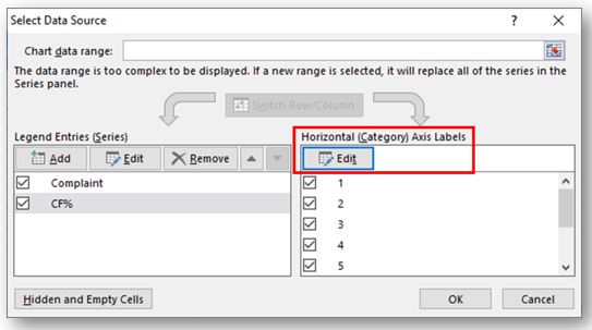
Here are few steps to collect data before you start preparing your Pareto Chart in Excel:
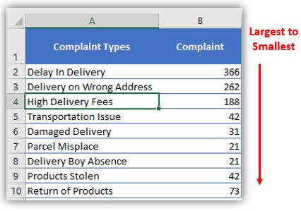
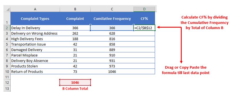
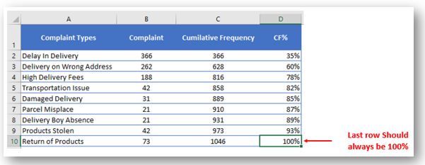
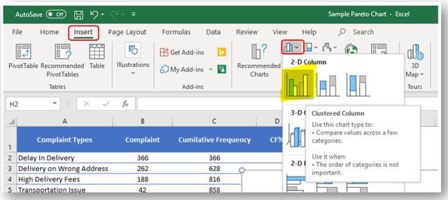
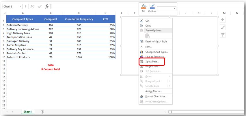
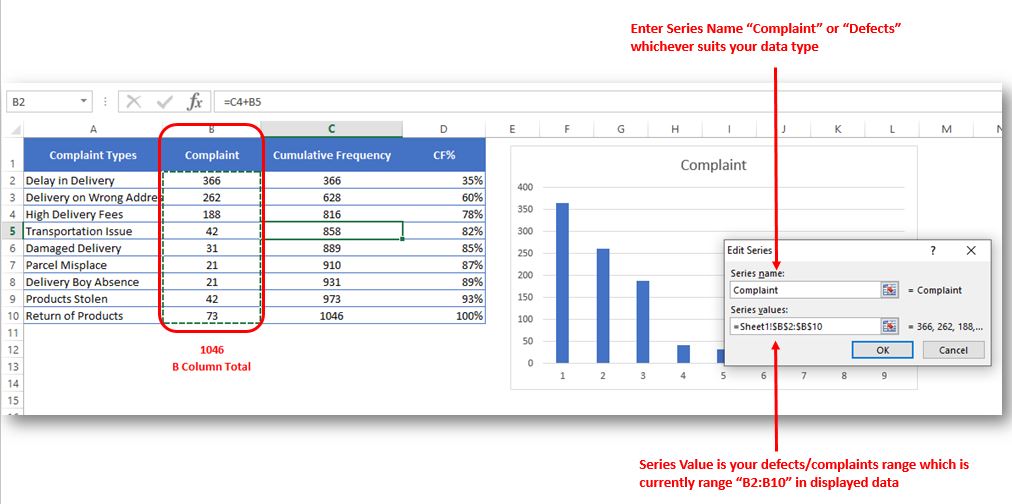
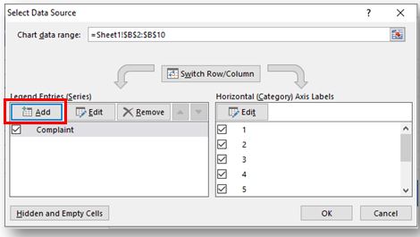
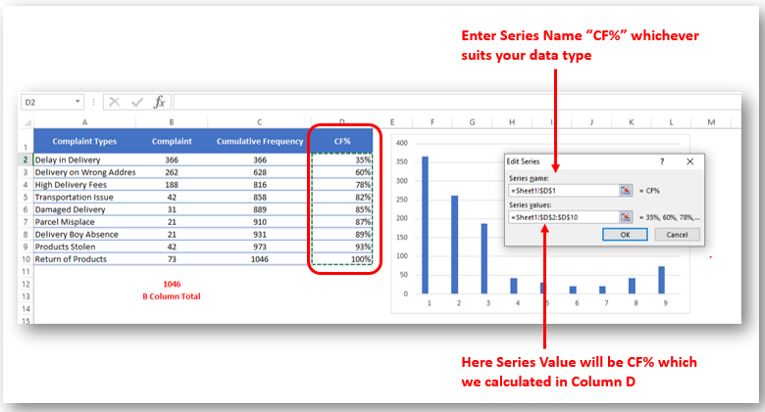
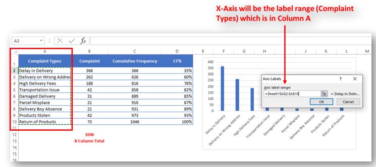
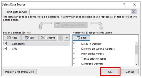
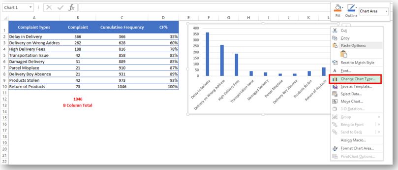
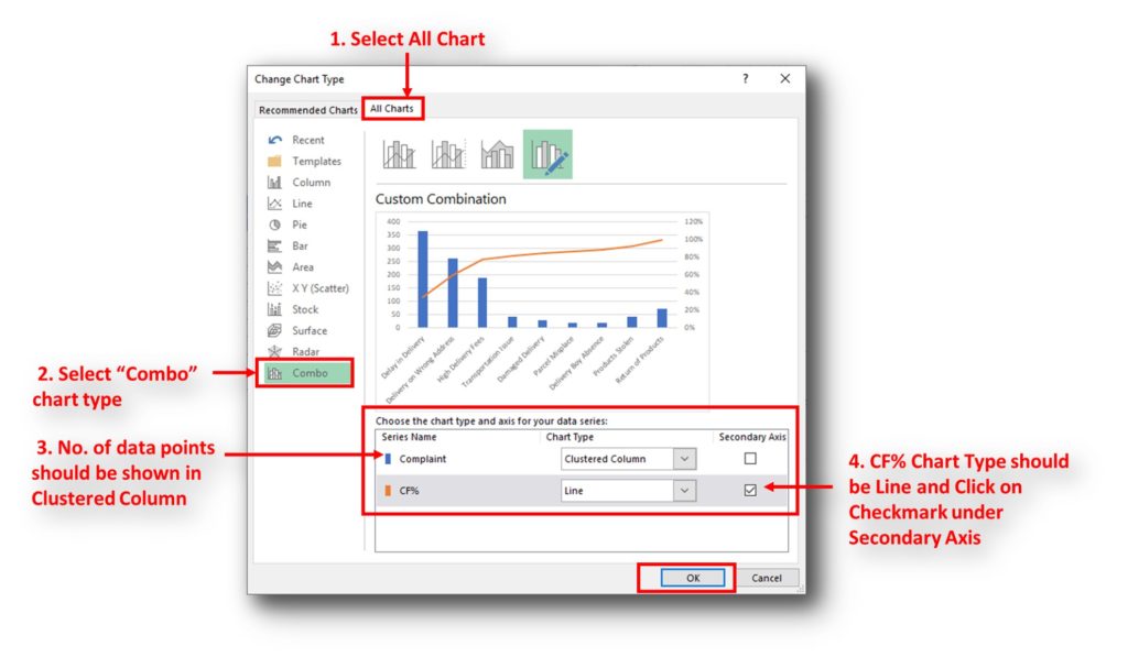
Here I collated the Complaints data from one of the Courier Company survey and will create Pareto Chart for them. Lets follow the steps now:
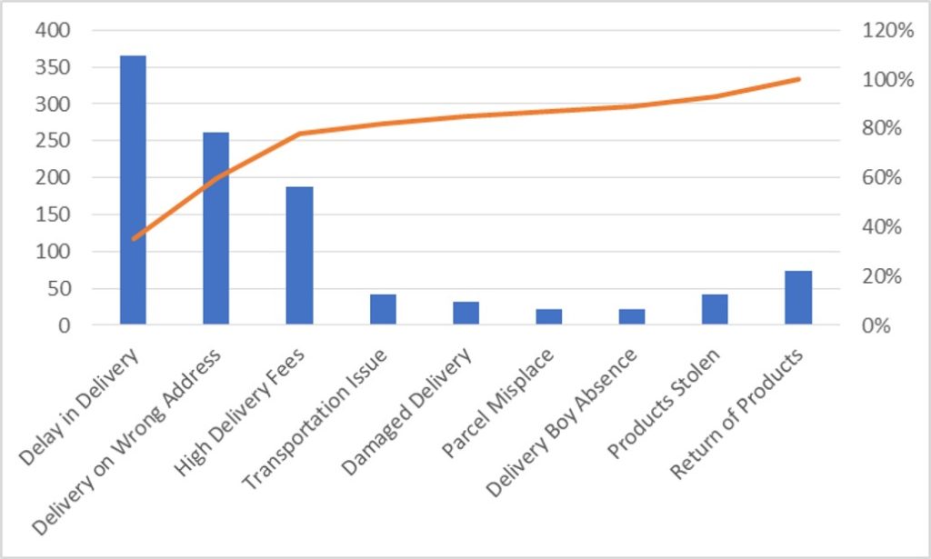
So here your Pareto chart is ready. This will help you to showcase the major pain areas or impacted areas in visual display
Now if you want to make this chart more appealing and visual. Then you can do this by learning tricks about formatting charts.
Hope you liked this article. Please comment below for any questions and for your feedback about this tutorial.
Follow us by Subscribe Us option for new updates

Few Excel Tips 1. CHANGE DIRECTION WHEN YOU PRESS ENTER Whenever you press enter, you must be thinking why my cell selection shifts down. Why it can’t go UP, Down, Left. Surprised This is very…

This feature is particularly useful for summarizing data or improving the readability of complex sheets.

In Excel, a line break lets you finish one line of text and begin another within the same cell. It helps create separate lines of information without needing to move to a different cell.
How to Find Duplicate Files In excel using VBA? Yesterday I was working on my computer and cleaning the drives to make some more space. I was surprised to see so many files saved at…

This Excel VBA Code converts the excel range into HTML and also can convert Excel to HTML Table to paste data on Outlook Email Body

This video will help you to understand how you may use conditional formatting to highlight row based on conditions. Subscribe us for more updates
I really liked this article. Well drafted. Thanks for the help 🙂