Pie Chart is one of the ways of visual presentation of your data sets. Sometimes it makes easier to understand the data while visualizing it rather than reading.
Pie Chart comes with enhanced features which makes it often used in presentations in school and office work. As the name suggests it shows the data in Pie format which is divided in slices. Generally, a Pie make up to 100% which is divided in multiple slices.
So, Lets explore how you understand the data quickly:
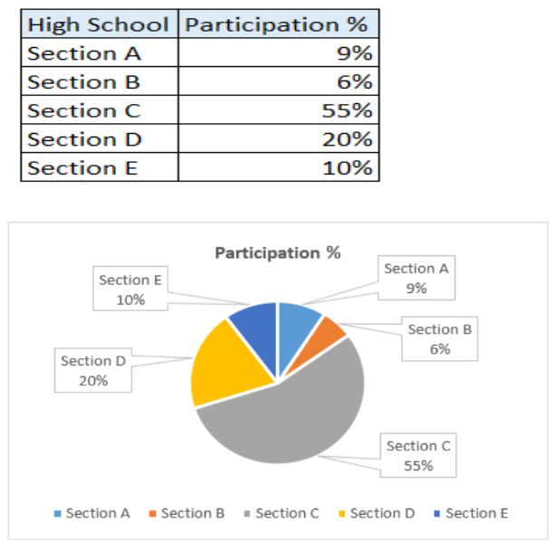
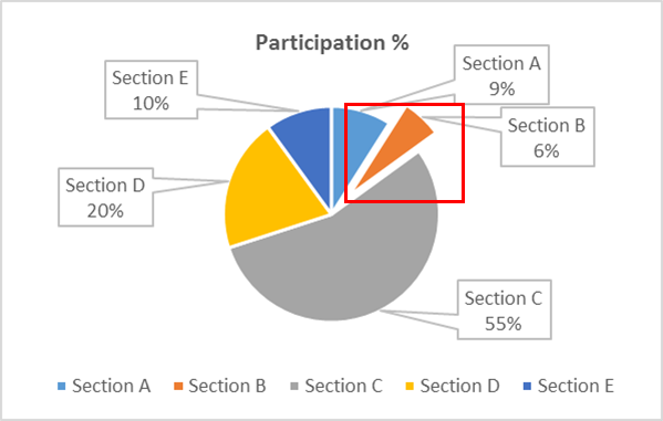
If we want to know the name of “Highest Participated Section” in the dateset available, from which option you can just quickly get the answer? From Dataset or from Pie-Chart.
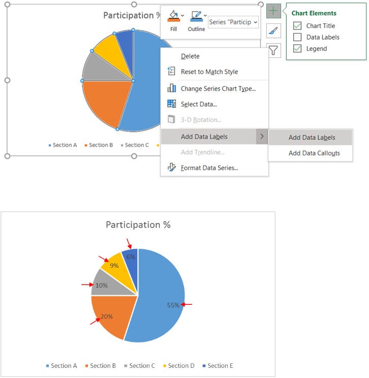
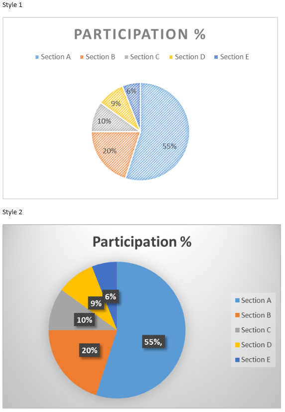
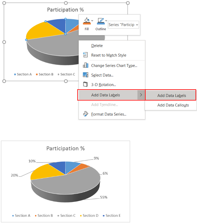
Off course from Pie-Chart we can easily make-out that, Section C is the highest with 55% of participation level. In Data set you may need to read out all the numbers and then only you would get the answer, whereas Pie chart answered quickly.
This is one of the reasons where people choose Pie-Chart for presenting the data set and help audience to understand and make decisions quickly.
Here we will be discussing step by step procedure of Microsoft Excel for creating the Pie Chart from the available data set. So, continue reading the article to explore:
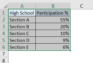
Step 1: Select the data->
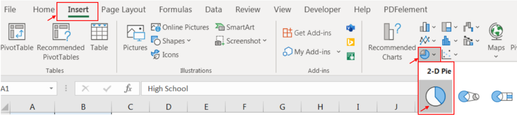
Step 2: Go to Menu->
Step 3: Click to Insert ->
Step 4: Click to Pie Icon ->
Step 5: Click to 2-D Pie
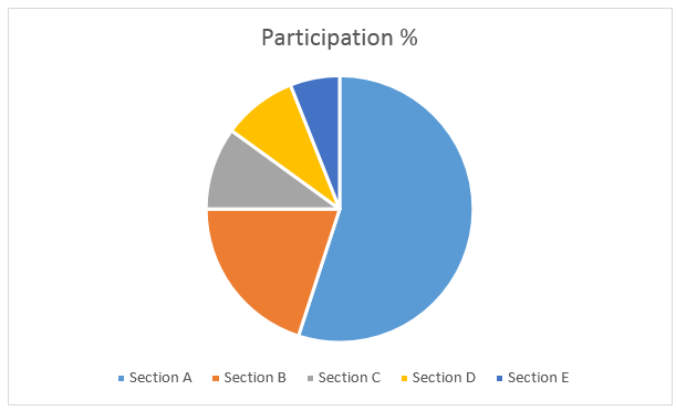
Default Pie Chart will be auto created
Here we will be formatting the Pie Chart to add values and make it more interactive
It is very difficult to read the chart without the data points. To add the Data Labels to chart, follow below steps:
Step 1: Click to Right Click to Chart ->
Step 2: Click to Add Data Labels ->
Step 3: Click to Add Data Labels
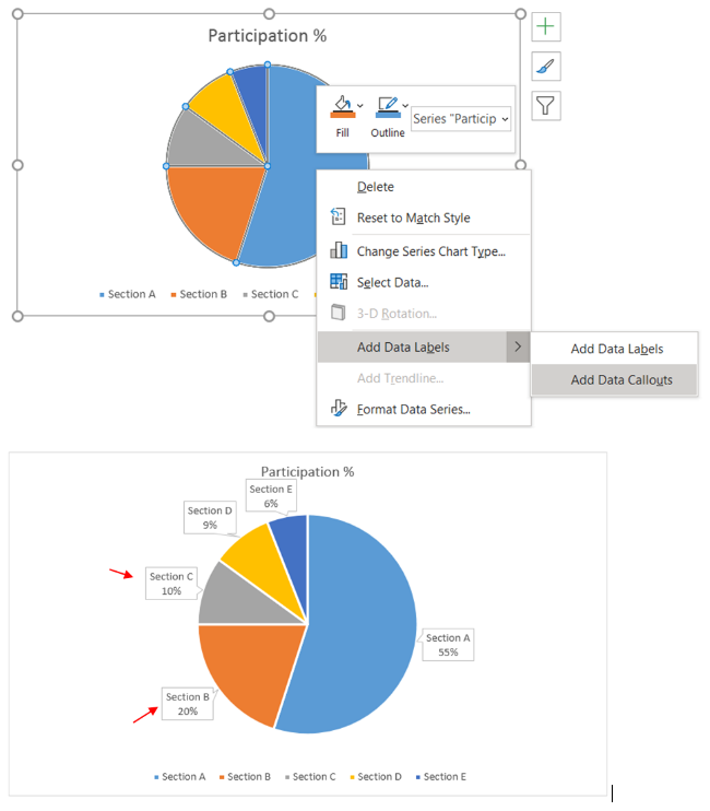
If you also want that description of data points are also be shown, then Callout option can be chosen. Follow:
Step 1: Click to Right Click to Chart ->
Step 2: Click to Add Data Labels ->
Step 3: Click to Add Data Callouts
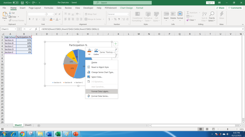
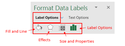
Format Data Labels helps to add features to your chart, like changing colors, shadows, size of charts, alignments. Text related formatting, like colors, shadows, textbox etc. Let’s explore:
Step 1: Click to Right Click to Chart ->
Step 2: Click to Format Data Labels…
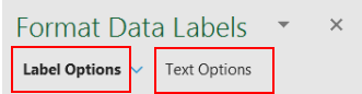
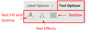
New option window will appear on a side of window. There will be two categories i.e. Label Options and Text Options :
Label Options can further be explored with Fill and Line, Effects, Size and Properties and Label Options
->Fill and Line : Used to Fill Colors i.e. No Fil, Solid Fil etc. and Borders i.e. No Line, Solid Lines etc.
->Effects: Used for adding Shadows, Glow, Soft Edges, 3D Format
->Size and Properties: Used for Size i.e. Height, Width, Alignment
->Label Options: Used for Label Contains options i.e. Series Name/ Category Name etc., Label Position, Numbers
Text Options can further be explored with Text Fill and Outline, Text Effects and Textbox
->Text Fill and Outline: Used for Text Fill, Text Outline
->Text Effects: Used for Text Shadow, Reflection, Glow, Soft Edges, 3-D Format, 3-D Rotation
->Textbox: Used for Alignment, Direction etc.
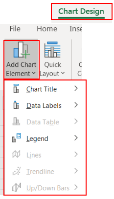
Chart Title-> None, Above Chart, Central Overlay
Data Labels-> None, Center, Inside End, Outside End, Best Fit, Data Callouts
Legend-> None, Right, Top, Left, Bottom
.
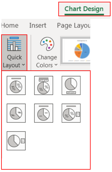
This option will give you predefined layouts. There are seven predefined layouts per below screen and can be chosen per the requirement
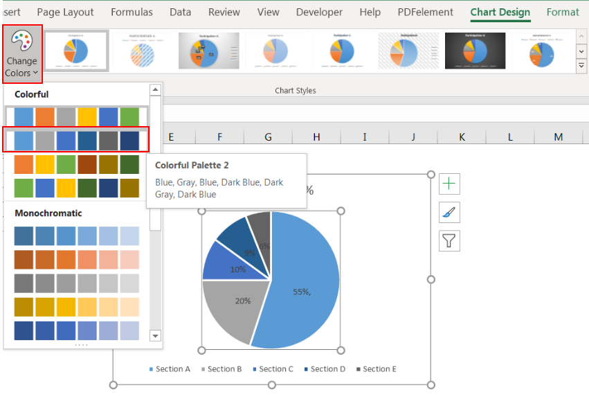
Chart color can also be chosen from “Change Colors” option available.
Just Click to desired Colorful Palette and your chart’s color will be changed.
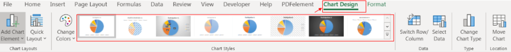
There are variety of options available from which you can change the appearance of your chart. Just Click to Chart and “Chart Design and Format” menus will visible in Menu Bar
Just click to any of chart design to match your requirement. For example:
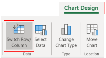
This will change the data over the axis, like X axis will swap to Y axis or vice versa.
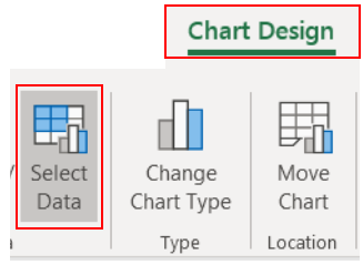
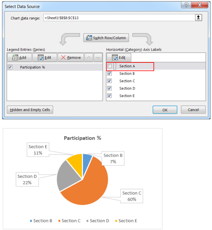
This will help to Select your data, if some few of many is to be shown in chart then required data points can be selected.
Once you click to “Select Data” a window will appear, and you can choose your data points.
For example, if you wish not to include “Section A” in the chart, just Uncheck “Section A” and Click to “OK”
Chart will be updated excluding “Section A”
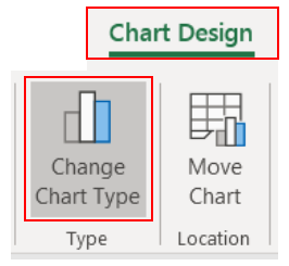
Feature can really be helpful to change the type of the chart. There are variety of options available.
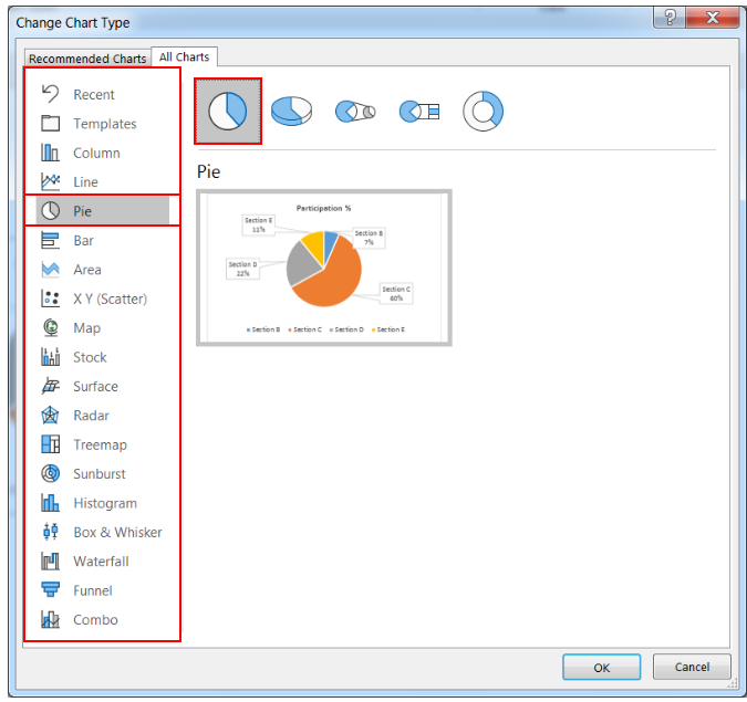
Once you click to “Change Chart Type” below window will appear with various Chart Types i.e. Columns, Line, Pie, Bar, Area, X Y Scatter etc.
Any of them which suits the requirement can be chosen:
Currently Pie -> Pie is selected
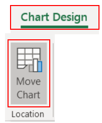
Changing of your chart location can be done with this option.
Once you click to “Move Chart” below window will appear:
Just provide the desired location and click to “OK”
This will end of learning basic Pie Chart. Let’s explore some of the more interesting features of Pie Chart
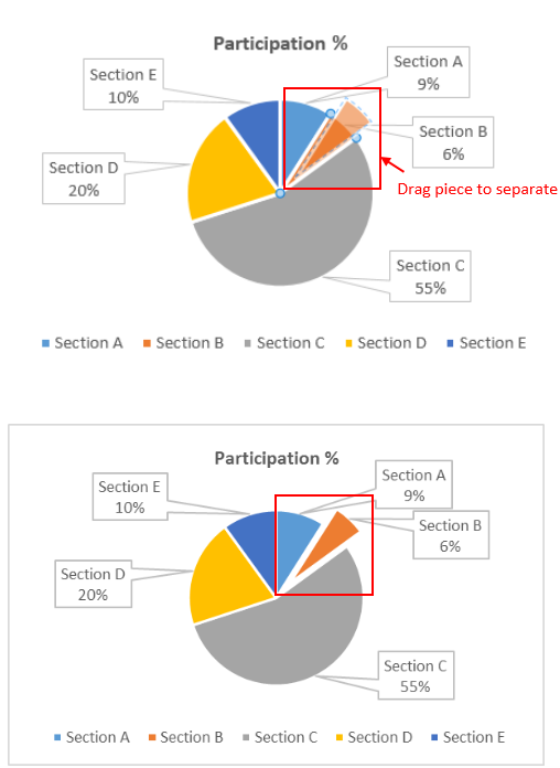
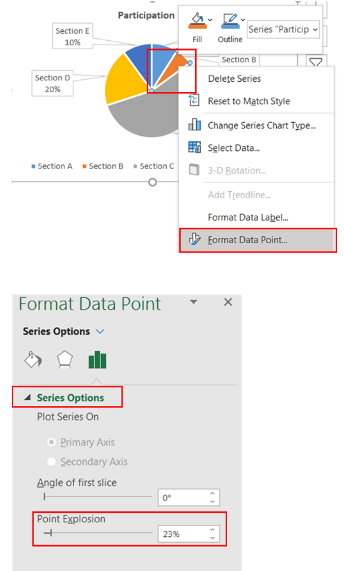
Select your piece of pie and just drag to upwards and slicing will be done
Step 1: Select your piece of pie ->
Step 2: Right Click on it ->
Step 3: Click to Format Data Points… ->
Step 4: Change the percentage value in “Point Explosion” under Series option. And slicing will be done.
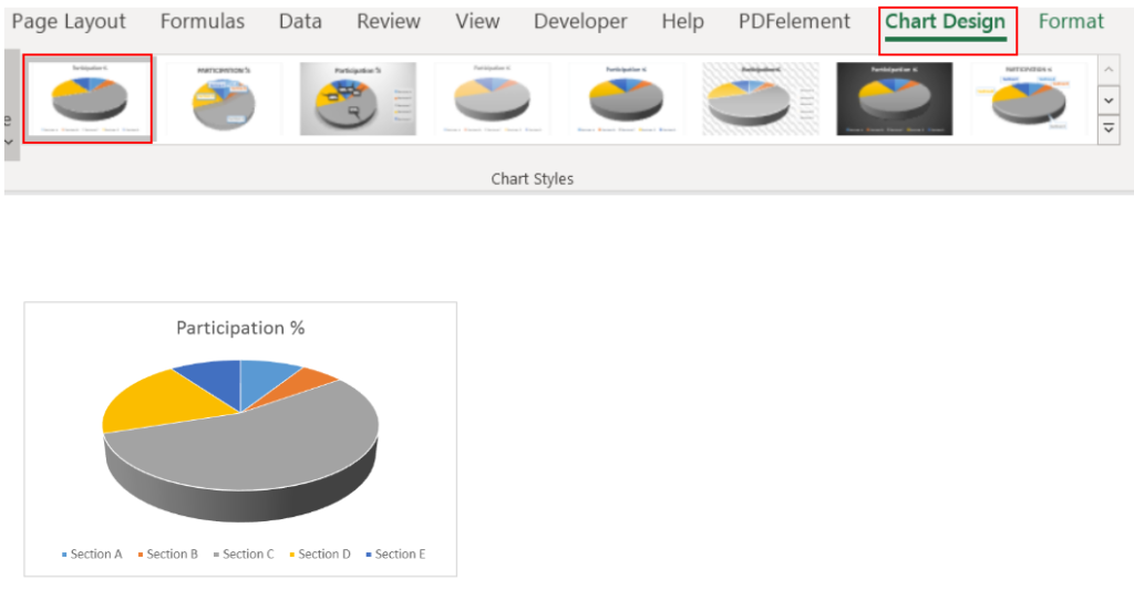
3-D Chart preparation is also a way of presentation and variety of features available for this chart.
If Chart format is to be changed to 3-D Pie, then follow below:
Step 1: Click to Chart Design ->
Step 2: Click to Change Chart Type ->
Step 3: Click to Pie ->
Step 4: Click to 3D Pie
(if you want to create the chart first, then refer to “How to Create Pie-Chart” section above)
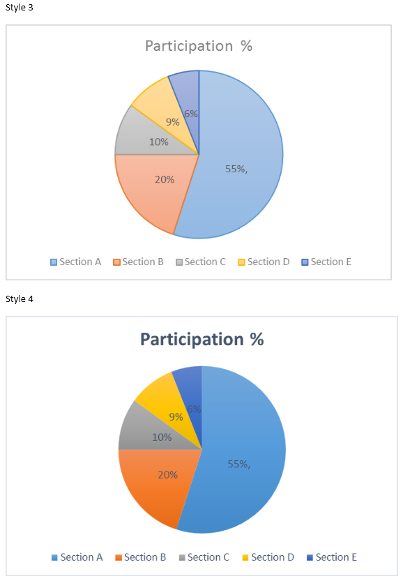
Choose any of the Style from the Chart Design Menu. Here we chosen “Style 1” for example:
Once 3-D chart is created, it is sometimes very difficult to read if there are very less differences among data points.
Data points which are closer to us always looks like bigger than the others. So, it is always better to add Data Labels to 3-D chart by following below:
Step 1: Right Click to Chart ->
Step 2: Click to Add Data Labels->
Step 3: Click to Add Data Labels
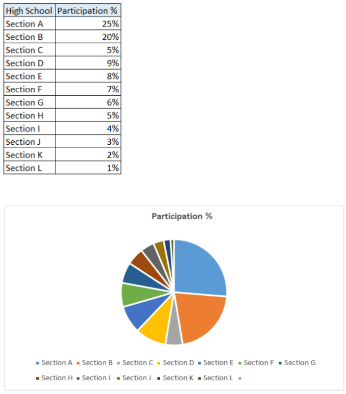
Pie Chart is very useful and easy to visualize whenever there are few items to analyze, however if there are so many items, it is very difficult to read.
For example, there are many data points and very difficult analyze to make a effective decision
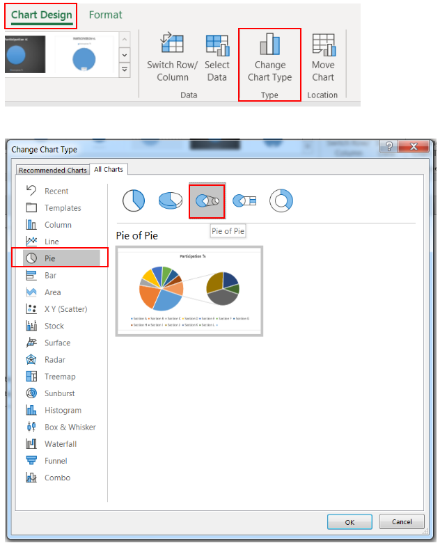
Here it comes the Pie of Pie chart, that will be combined small vales together and show them in separate chart.
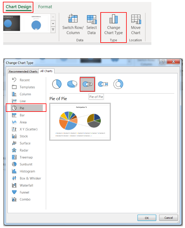
Step 1: Click to Chart Design ->
Step 2: Click to Change Chart Type ->
Step 3: Click to Pie ->
Step 4: Click to Pie of Pie
(if you want to create the chart first, then refer to “How to Create Pie-Chart” section above)
Click to “OK”
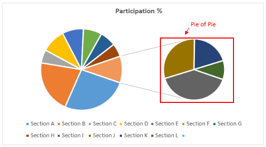
Below Chart will be created. It will combine few bottom data points and create a separate Pie chart for them.
Here in example, Pie of Pie chart combined bottom four data points and created a separate Pie chart.
If you want to change the bottom data points for Pie of Pie chart, then follow below:
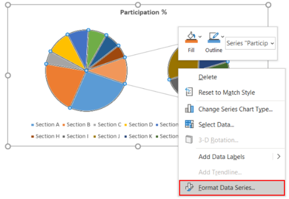
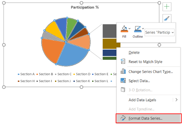
Step 1: Right Click to Pie Chart ->
Step 2: Click to Format Data Series… ->
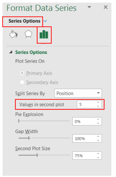
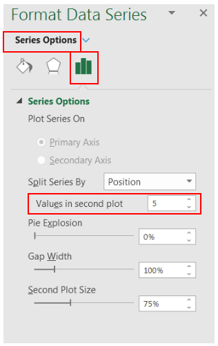
Step 3: Change values in “Value in second plot” (under Series Options)
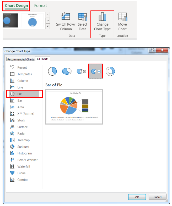
Bar of Pie chart is also created in the same manner to Pie of Pie chart. Difference is in only ways of presentation a Bar chart will be created to showcase the bottom few data points. Follow below:
Step 1: Click to Chart Design ->
Step 2: Click to Change Chart Type ->
Step 3: Click to Pie ->
Step 4: Click to Bar of Pie
(if you want to create the chart first, then refer to “How to Create Pie-Chart” section above)
Click to “OK”
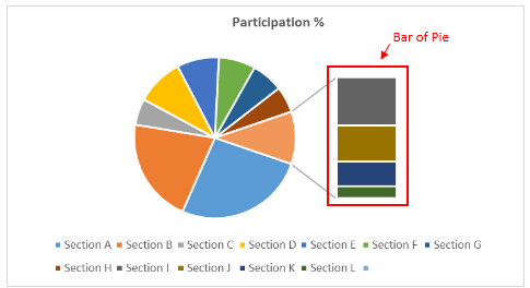
Below Chart will be created. It will combine few bottom data points and create a separate Bar chart for them.
Here in example, Bar of Pie chart combined bottom four data points and created a separate Pie chart.
If you want to change the bottom data points for Bar of Pie chart, then follow below:
Step 1: Right Click to Pie Chart ->
Step 2: Click to Format Data Series… ->
Step 3: Change values in “Value in second plot” (under Series Options)
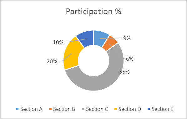
It is called Doughnut because it looks like Doughnut. Creating Doughnut chart is also very easy, just follow through:
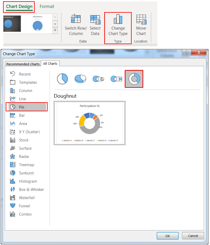
Step 1: Click to Chart Design ->
Step 2: Click to Change Chart Type ->
Step 3: Click to Pie ->
Step 4: Click to Doughnut
(if you want to create the chart first, then refer to “How to Create Pie-Chart” section above)
Click to “OK” and your Doughnut chart is ready.
Hope you liked this article !!
Subscribe our blog for new amazing excel tricks. Click to below for some more interesting tricks and learning:
Please leave your valuable comments in Comments section:

Understand how to find median in Excel with simple steps. Understanding the middle value in a set of numbers, known as the median, is important in the data industry. Professionals often use Microsoft Excel to calculate this. Excel’s MEDIAN function helps quickly find this value from long lists of numbers. This saves time and allows for further calculations using the median value. In this article, we explain what the MEDIAN function in Excel does, why it’s useful, and two methods to find the median in your data.

Video: How to Hide Worksheet in Excel? Hide Sheet in Excel When I was creating an excel dashboard, there were multiple sheets which I used for calculation purpose and never wanted anybody to make any…

How to protect and share your workbook? Creating beautiful and professional dashboards, projects always lead you to success however there are places when you wanted to protect your dashboards, sheets, cells to prevent users to…

While starting Excelsirji.Com, it is always been critical for me to find the best to amaze the viewer experience. So I spent many hours on web to read, explore amazing excel content which I really…

This Excel VBA Code helps to Get User Name. Here is an example environ(username) or Application.username.This macro gets the username from active directory.

Few Excel Tips 1. CHANGE DIRECTION WHEN YOU PRESS ENTER Whenever you press enter, you must be thinking why my cell selection shifts down. Why it can’t go UP, Down, Left. Surprised This is very…